
Taming React Native’s ScrollView with flex
Time and time again I find myself fighting a ScrollView to get it to work the way I want it to. Is it flex? Is it the ScrollView? It was time I wrote an article.
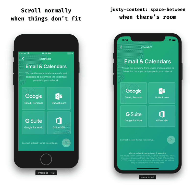
My favorite scenario, the one that inspired this article, the one that I always forget about, the one I recently encountered for Orchard, (what a build-up) is one where I’d like the screen to scroll normally when things don’t fit and justify-content: space-between when there’s room.
A couple of different solutions came to mind at first:
- Use either
VieworScrollViewdepending on the device height (meh) - Decrease the text size until everything fit (meh)
- Place the “Privacy Policy” outside of the
ScrollViewmaking it sticky, but it felt weird to scroll over and still see the privacy policy.
I felt like these options would either make my life miserable or even worse: the user’s life miserable. I went to the docs for ScrollView and read over contentContainerStyle:
These styles will be applied to the scroll view content container which wraps all of the child views
contentContainerStyle is a step in the right direction. It will apply styles to the content container as if there were a View wrapping your children.
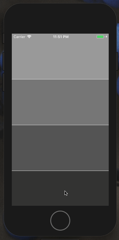
It worked great on the iPhone X. There was enough room so everything was justified vertically. But what happens when you try this on a smaller device like the iPhone 5s? It sticks! Why?
React Native Flex vs. CSS Flex
It turns out that flex functions a bit differently in React Native than it does in CSS which is why setting flex: 1 didn’t work the way I thought it would.
In CSS, flex is short-hand for controlling the following properties:
flex-growflex-shrinkflex-basis
Writing flex: 1 in CSS is shorthand for:
flex-grow: 1flex-shrink: 1flex-basis: 0
In React Native, on the other hand, flex consumes a number, not an string and it works like this:
- positive number — component becomes flexible and will function proportionally to its value. A value of 2 will take up twice as much space as a sibling that has a value of 1.
- 0 — the component isn’t flexible and is sized by
widthandheight. - -1 — the component is sized by its
widthandheightbut if there’s not enough space, it will shrink to satisfyminWidthandminHeight.
Flex Grow
Writing flex-grow: 1 in CSS is shorthand for:
flex-grow: 1flex-shrink: 1flex-basis: auto(this is different!)
flex-grow distributes free space to flex items. When there is no free space, flex-grow does nothing and flex-shrink takes over to determine how much items will shrink relative to its siblings (instead of grow).
Why does this matter?
The solution has to do with the implementation differences of flex and flexGrow in React Native.
Since flexGrow functions the same way, we can easily solve this problem by updating our contentContainerStyle to flexGrow: 1 instead:
Using flexGrow vs. flex in contentContainerStyle prop
Hopefully neither of us will have to struggle with a ScrollView and flex again!